Customizations of the UI may be desired to establish a certain identity of an app. There are two ways to go about UI Customization:
Theme Manager
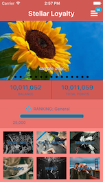
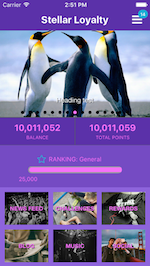
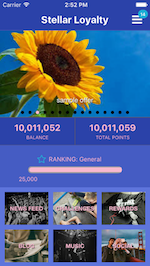
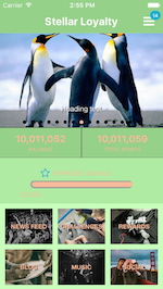
The Loyalty UI Kit contains a class called ThemeManager, this class is responsible for applying the Theme related to colors and appearances of the texts inside the app.
Color Theme
To create a color theme for an app, create a struct that conforms to ColorTheme Protocol. Conformimg to this protocol will require the struct to provide the following properties:
- primaryColor
- secondaryColor
Additionally there are properties that already have a default value but can be replace by a custom value as needed:
- textColor
- textInputColor
- primaryVariantColor
- errorColor
- barItemColor
- disabledButtonColor
- highlightedButtonColor
public struct CheetahColorTheme: ColorTheme {

    public let primaryColor = UIColor(hex: "B1E4E3")

    public let secondaryColor = UIColor(hex: "F4364C")

}
To apply the created theme call the applyColor(theme: ColorTheme) method of the singleton instance of the ThemeManager and make sure that the window that the app uses is an instance of CheetahAppWindow. This setup is preferably call in the app delegate of the application.
func setupTheme() {
    ThemeManager.shared.applyColor(theme: CheetahColorTheme())
    window = CheetahAppWindow(frame: UIScreen.main.bounds)
}
Text Appearance
TextAppearance protocol is used for modifying the appearances of the texts inside the other parts of the Loyalty SDK without subclassing them.To do this create a struct that conforms to TextTheme and provide the necessary structs that conform to TextAppearance.
public struct MyLargeTitle: TextAppearance {

    public var fontName: String = "Helvetica"

    public var textColor: UIColor = .blue

    public var textStyle: UIFont.TextStyle? = .largeTitle

    public var fontSize: CGFloat?

}
There are 2 ways on providing the size of a text appearance which will be either providing values on the textStyle or fontSize property in which the former will be always prioritized over the latter if both properties have values.
These are the following elements that support setting of text appearance:
- UILabel
- UIButton
- UITextField
- UITextView
- UITextViewCell
- UIBarItem
- UINavigationBar
The sample code below is an example of creating a struct that conforms to TextTheme protocol and provides the necessary values to its properties.
public struct CheetahTextTheme: TextTheme {

    public var largeTitle: TextAppearance = CheetahLargeTitle()

    public var title1: TextAppearance = CheetahTitle1()

    public var title2: TextAppearance = CheetahTitle2()

    public var title3: TextAppearance = CheetahTitle3()

    public var headline: TextAppearance = CheetahHeadline()

    public var subheadline: TextAppearance = CheetahSubheadline()

    public var body: TextAppearance = CheetahBody()

    public var callout: TextAppearance = CheetahCallout()

    public var footnote: TextAppearance = CheetahFootnote()

    public var caption1: TextAppearance = CheetahCaption1()

    public var caption2: TextAppearance = CheetahCaption2()

    public var alertButton: TextAppearance = CheetahAlertButtonTextAppearance()

    public var textView: TextAppearance = CheetahTextViewTextAppearance()

    public var textField: TextAppearance = CheetahTextFieldTextAppearance()

    public var normalButton: TextAppearance = CheetahNormalButtonTextAppearance()

    public var disabledButton: TextAppearance = CheetahDisabledButtonTextAppearance()

    public var highlightedButton: TextAppearance = CheetahHighlightedButtonTextAppearance()
}
To change the text appearance of texts on other Loyalty Digital Kits like Challenges Kit, simply change the text property of the shared instance of the ThemeManager.
func setupTheme() {
    ThemeManager.shared.applyColor(theme: CheetahColorTheme())
    ThemeManager.shared.text = CheetahTextTheme()
    window = CheetahAppWindow(frame: UIScreen.main.bounds)
}
For texts that are not handled by the Theme Manager it is advisable to use the setTextAppearance(_ textAppearance: TextAppearance) or setTextStyle(_ textStyle: ThemeManager.TextStyle) method of the views that that are supported for easier tracking of styles that are applied. This is also advisable because these method also allows easier styling of text per state of a button.
sampleLabel.setTextAppearance(MyTextAppearance())
sampleLabel.setTextStyle(.body)
Layout Customization via Nib/Storyboard
Changing Layout of a View Controller
Customizing the UI layout of a certain screen can be done in two ways. One is creating a subclass of a view controller with a corresponding nib. The other is to create a nib with the name of the class that will be used. For example, the Detail View Controller of the Loyalty UI Kit will be used as the screen that will be modified indicated in the steps below:
Subclassing a view controller
- Create a view controller and provide a nib file.
-
Import CheetahDigitalUI and make the class as the subclass of the desired view controller. For this example
DetailViewControllerimport CheetahDigitalUI class AppDetailViewController: DetailViewController { // Provide customization as necessary } - Connect the required
IBOutlets.
Note: It is recommended that the file name of the swift class is the same with the file name of the nib to avoid providing the
nibNamein the init of the class.
Due to a bug in .xcframeworks where the IBOutlets of the superclass doesn’t appear in the nib, It is needed to override the IBOutlets in the subclass. Doing this will make the IBOutlets of the superclass in the nib appear enabling connection it to the needed views. And after, delete the overridden IBOutlets.
Creating a nib with the same filename inside the Loyalty UI SDK
- Create a nib and named it with the same file name of the nib in the UI SDK.
- Change the custom class in the
Identity Inspector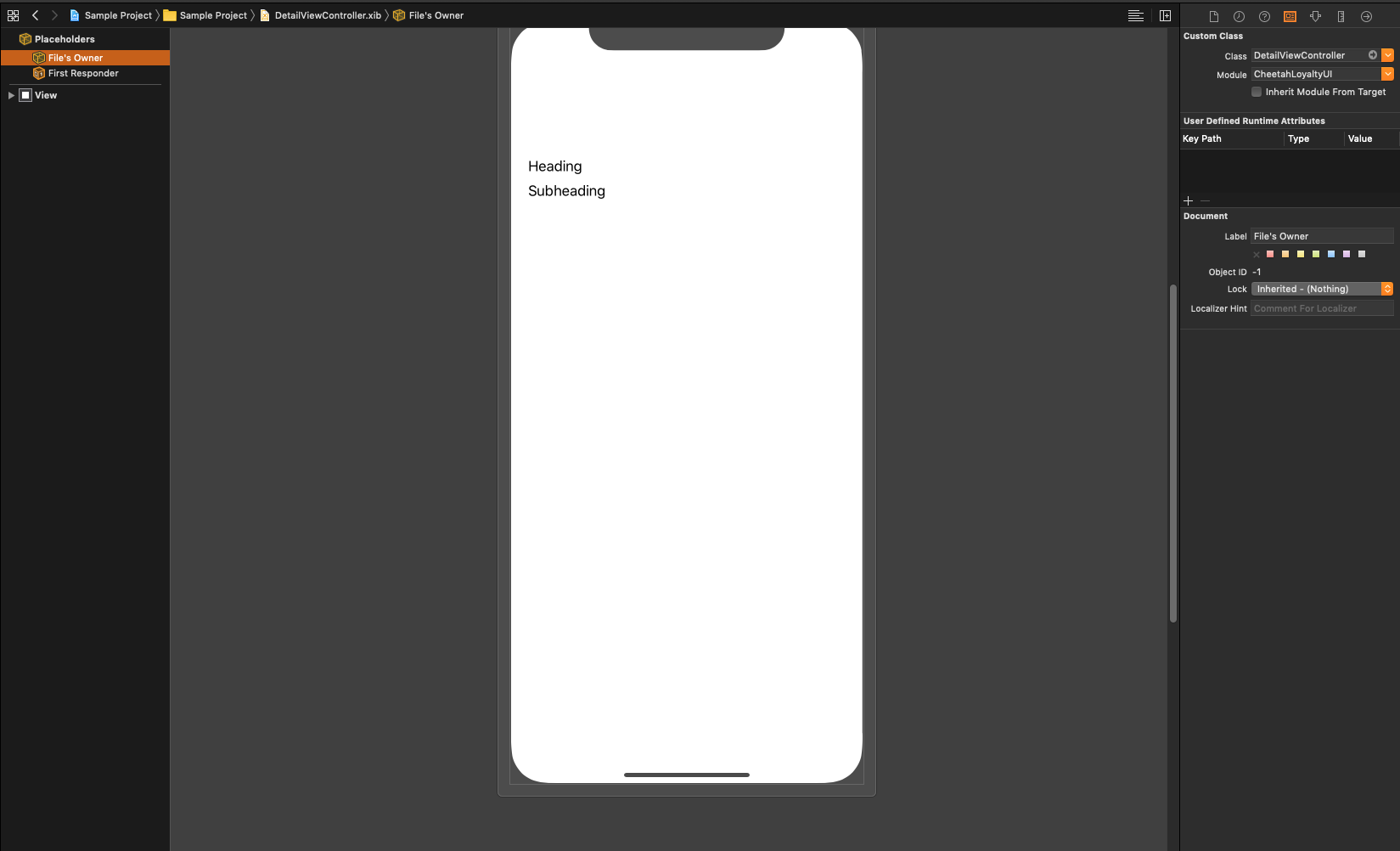
- Connect the outlets to the views.
Note: Due to a bug in .xcframeworks where the IBOutlets of the superclass doesn’t appear in the nib, it is needed to override the IBOutlets in the subclass. Doing this will make the IBOutlets of the superclass in the nib appear enabling connection it to the needed views. Final step will be to delete the created temporary class.
Changing Layout of a Cell
Subclassing a cell
For creating a custom cell that will be use in a Reward list.
- Create a nib for the UICollectionViewCell.
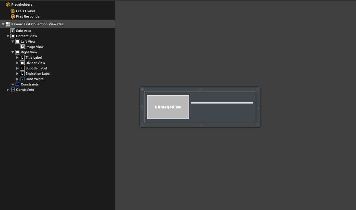
-
Create a class for the created nib on step 1.
class RewardListCollectionViewCell: UICollectionViewCell { @IBOutlet weak var imageView: UIImageView! @IBOutlet weak var titleLabel: UILabel! @IBOutlet weak var subtitleLabel: UILabel! @IBOutlet weak var expirationLabel: UILabel! @IBOutlet weak var dividerView: UIView! override func awakeFromNib() { super.awakeFromNib() dividerView.backgroundColor = .primary titleLabel.setTextStyle(.body, alignment: .natural) subtitleLabel.setTextStyle(.subheadline, alignment: .natural) expirationLabel.setTextStyle(.caption1, alignment: .natural) } } -
Override the
registerComponents()andcollectionView(_ collectionView: UICollectionView, cellForItemAt indexPath: IndexPath) -> UICollectionViewCellmethods of the list controller that will use the created cell, in this exampleRewardListController.class RewardListController: ListCollectionController<Reward> { override func registerComponents() { collectionView?.register(RewardListCollectionViewCell.nib(), forCellWithReuseIdentifier: RewardListCollectionViewCell.nibName()) } /* API Call Other list controller methods */ override func collectionView(_ collectionView: UICollectionView, cellForItemAt indexPath: IndexPath) -> UICollectionViewCell { let reuseIdentifier = RewardListCollectionViewCell.nibName() let dequeuedCell = collectionView.dequeueReusableCell(withReuseIdentifier: reuseIdentifier, for: indexPath) guard let cell = dequeuedCell as? RewardListCollectionViewCell else { return dequeuedCell } /* Cell Customization */ return cell } }
Creating a cell with the same filename inside the Loyalty UI SDK
The steps for changing the layout of the default cells like ListItemCell is identical to the Creating a nib with the same filename inside the Loyalty UI SDK
on changing the layout of a view controller.
Next: Kit Reference